How to Create Architecture Diagrams: A Complete Guide
Learn the fundamentals of creating clear, effective software architecture diagrams. Covers C4 model, diagram types, best practices, and step-by-step instructions for teams of any size.
I've sat through about fifty architecture reviews in my career. Maybe a third of them went well. The common thread in the good ones wasn't a better architecture — it was a better diagram. Reviewers could see what was being proposed, and the discussion moved from “what are you building?” to “should you build it that way?” within the first five minutes.
In the bad ones, we spent forty-five minutes just aligning on what the system actually looked like. By the time the real debate started, everyone was tired and the decision got deferred to a follow-up meeting that never quite happened. The architecture wasn't worse. The diagram was.
This guide is what I wish I'd known before my first review. It covers the diagram types that are actually useful, why the C4 model is worth adopting, and the specific mistakes that derail architecture reviews. It does not try to cover every diagram notation ever invented — most of them don't earn their complexity.
What an architecture diagram is actually for
The goal is not to document every class, table, and config file. That's what code is for. An architecture diagram exists to answer one specific question: given a new engineer, what do they need to see in order to reason about changes to this system?
Phrased that way, a lot becomes obvious. You don't need to show the CI pipeline in a deployment diagram someone will use during incident response. You don't need to show every internal service call in a context diagram someone will use to explain the product to a new hire. Each diagram has an audience and a question; the shapes you draw are the ones that answer that question, and nothing else.
The corollary: one system typically needs several diagrams, each focused. Most teams fail in the other direction — one giant diagram attempting to be everything to everyone, which ends up useful to nobody.
The five diagrams worth drawing
Over time I've settled on five diagram types that earn their keep. Most teams only need three of them at any given moment.
1. System Context
Your system as a single box in the center, with every external actor — users, third-party APIs, partner systems, the company's other products — shown around it. Arrows labeled with the nature of the interaction. This is the diagram you show to a new product manager on their first day, to an auditor, or to the CEO.
Rule of thumb: if it takes more than two minutes to read, it's not a context diagram anymore.
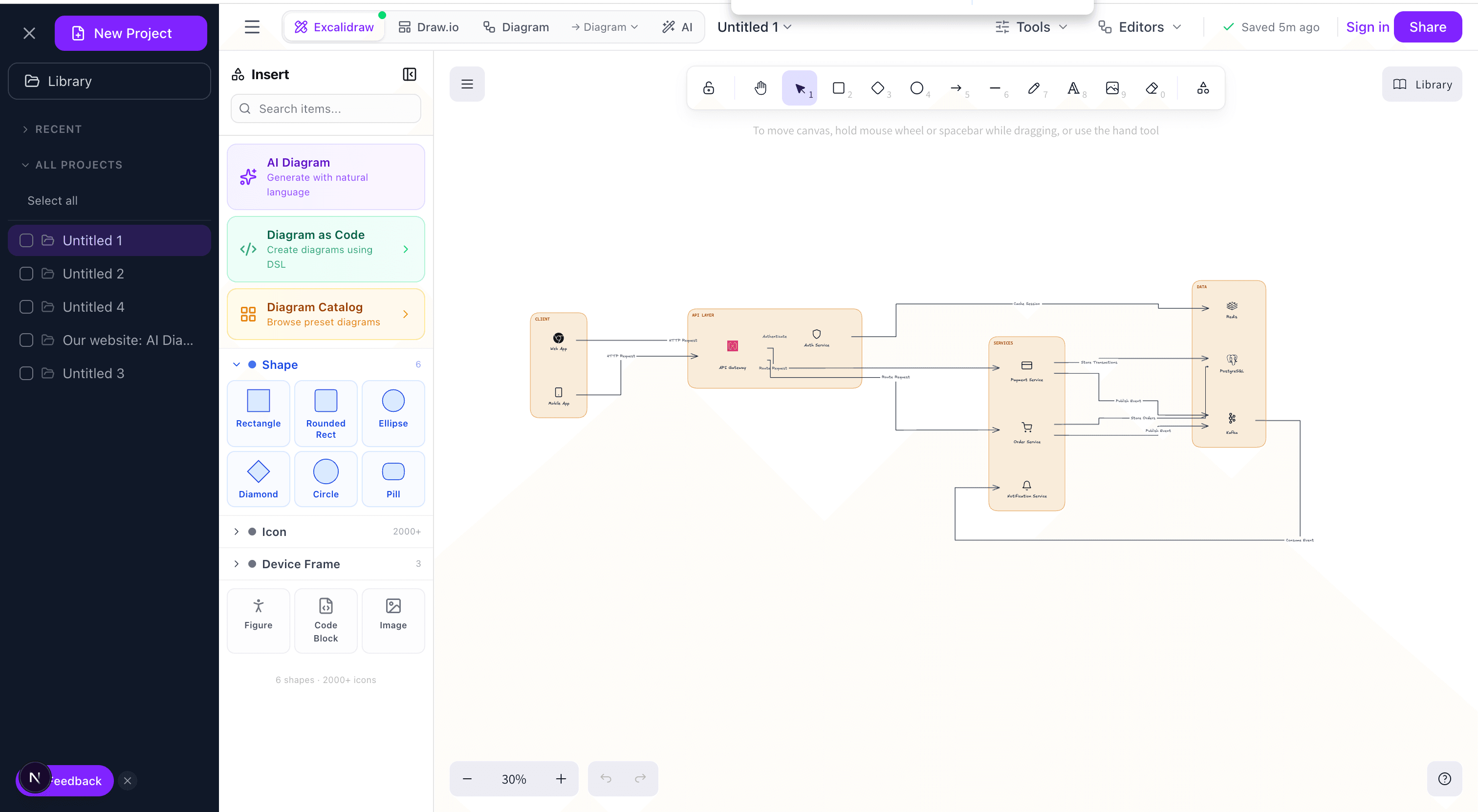
2. Container
The next level down. Your system decomposed into deployable units: the web app, the API, the worker, the database, the cache, the message queue. Each container has a technology label (Next.js, Postgres, Redis) and the protocol on each arrow (HTTPS, SQL, SQS). This is the working diagram for your engineering team. I reference it every week.
3. Deployment
Where things physically run. AWS regions, VPCs, ECS clusters, RDS instances, CloudFront distributions, the whole mess. Most teams don't need this until they're dealing with multi-region, disaster recovery, or regulated data residency. When you do need it, you need it badly.
4. Data Flow
Trace a specific piece of data from entry to persistence. Where does it live? Who transforms it? Who has access? Indispensable for GDPR, HIPAA, SOC 2. If you've ever been asked “where does PII live?” and not had a clean answer, this diagram is the answer.
5. Sequence (as needed)
Time-ordered interactions for a specific flow: login, checkout, webhook processing. This is closer to a flowchart than a traditional architecture diagram, but it earns its place when async messaging or complex retry logic is involved. Draw it per-flow; don't try to jam multiple flows into one sequence diagram.
The C4 model, pragmatically
Simon Brown's C4 model formalizes what the previous section gestures at: Context → Containers → Components → Code, each level zooming into the previous one. It's widely referenced but often half-adopted. A pragmatic take:
- Level 1 (Context) and Level 2 (Containers): worth drawing for every production system. The ROI is overwhelming.
- Level 3 (Components): worth it for services that are genuinely complex internally — a payment engine, a rules engine, a search indexer. For a standard CRUD API it's overkill.
- Level 4 (Code): skip. Auto-generate from code if you ever need it. Hand-drawn code-level diagrams are obsolete the day after they're drawn.
The value of C4 isn't the specific notation; it's the discipline of picking one level of abstraction per diagram. Mixing levels — a container diagram that suddenly shows individual classes inside one box — is the most common architecture-diagram failure mode.
A step-by-step I actually follow
Step 1: State the question
Write one sentence at the top of the canvas: “This diagram shows X so that Y can Z.” If you can't write that sentence, you don't know what the diagram is for and you'll produce a confused one. Example: “This diagram shows how the checkout service depends on external payment providers so that SREs can triage payment incidents.”
Step 2: List the nouns, then cut half
Write down every service, database, queue, and external system relevant to the question. Now delete the ones that aren't essential to answering it. The analytics pipeline probably doesn't belong on the checkout incident diagram. Be ruthless — the most common failure is including too much.
Step 3: Draw relationships as verbs
Arrow labels should be verbs: “charges”, “notifies”, “reads from”, not “HTTPS” alone. Protocol is useful but secondary — the primary label is what the connection does. I put the verb on top of the arrow and the protocol underneath in smaller text.
Step 4: Pick a visual language and commit
Cylinders for databases, rectangles for services, rounded rectangles for external systems, dotted borders for infrastructure. Whatever convention you pick, use it everywhere and document it in a small legend in the corner. Consistency matters more than the specific choices.
Step 5: Show it to someone who didn't build it
Every unanswered “what does this mean?” is a bug. Fix it in the diagram, not in a verbal explanation. If the diagram needs you standing next to it to be understood, it doesn't work.
Step 6: Check it into the repo
A diagram on a Confluence page nobody updates is worse than no diagram. Text-based formats — Mermaid, PlantUML, the Eraser-style DSL our AI diagram generator produces — diff cleanly in code review and stay honest because they travel with the code.
Mistakes that tank review meetings
- Mixed abstraction levels. The #1 architecture diagram sin. A container appears next to a class, and the reviewer no longer trusts any of the shapes. Enforce one level per diagram; split into multiple diagrams if needed.
- Unlabeled arrows. Ties with unlabeled decision branches in flowcharts for the most common diagram bug. An arrow with no label forces the reviewer to guess, and they will guess wrong half the time.
- Too many elements. If you have more than ~20 shapes in one diagram, the diagram is trying to do too much. Break it up by concern — one diagram for the synchronous path, one for the async path, one for the read path.
- Stale diagrams. A diagram that doesn't match reality is worse than no diagram because it actively misinforms. Either commit to keeping it current or delete it.
- Protocol soup. Every arrow labeled “REST” or “HTTPS” tells the reader nothing about the system. The protocol is background information; the purpose is the main label.
- Hidden assumptions. Authentication, retries, caching, circuit breakers — critical behaviors that live between services but never appear as shapes. If it's important to how the system behaves, it deserves a box or a label.
Tools, briefly
I've used most of the mainstream options. Quick takes:
- Excalidraw — Best for whiteboard feel and collaborative sketching. What we use in architecture review meetings and what our diagram editor is built on. Fast, legible, unpretentious.
- Draw.io / diagrams.net — Corporate-ready, strong shape libraries, integrates with Confluence. Slower to iterate with than Excalidraw.
- Mermaid — Text-based, renders in GitHub markdown. Limited layout control but diffs beautifully in code review.
- AI-first tools — Describe the system in English, get a first-draft diagram with ELK-based layout in seconds, then refine. This is where I start for any new system; manual editing picks up from there.
The right tool is the one your team will keep current. A beautiful diagram in a tool nobody logs into loses to a clunky one in the repo.
One last thing
Architecture diagrams are the cheapest high-leverage artifact in software engineering. An hour of diagramming has repeatedly saved my teams weeks of rework. The teams I've watched scale best treat the diagram as a first-class design artifact — reviewed, versioned, and updated alongside the code. The teams that struggle most have “we should really draw that” in a backlog that never ships.
Start with a single container diagram for your current system. Put it in the repo. Reference it in your next design review. That's the whole practice.
Try it yourself
Create diagrams instantly with AI Diagram — describe what you need and get a professional diagram in seconds.
Open Diagram EditorBuilder of CalcStack. Writes about software architecture, AI-assisted diagramming, and developer productivity. Follow on awais.calcstack.co.
Related articles